Interior design of public spaces in new Trebū HOME buildings

The architecture and interior design of Trebū HOME is developed by the experienced firm ARHIS ARHITEKTI. Therefore, we asked its architect Raimonds Saulītis to tell us more about the interior solutions of public spaces.
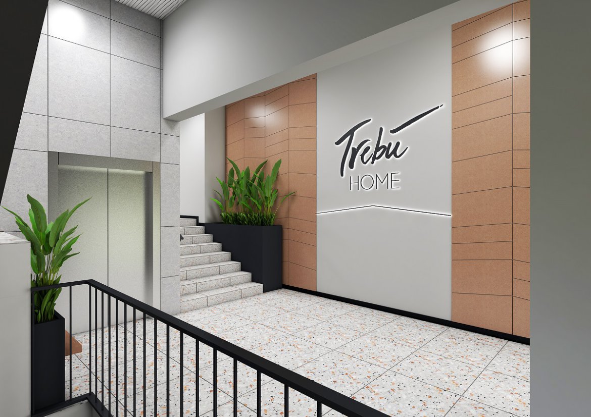
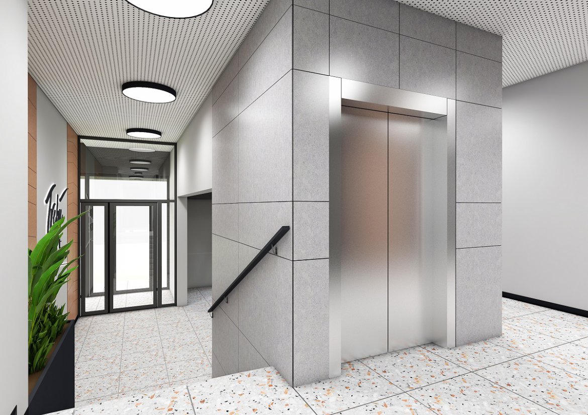
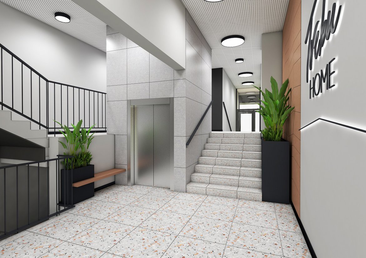
The interiors of public spaces of the planned new buildings follow the fundamental idea of using colour to separate the central core of the building, which includes vertical movement elements, the stairs and the lift, from the outer wall of the core, which has the entrance door to the house. The main emphasis in this space is laid on the entrance doors of the apartments, accentuating them with high-quality finishing materials and special colouring of the wall. A darker shade has been selected for the stairs and the doors, offering a clear functional indication of the direction of movement and points of interest, for easy navigation by every user of the building.
Additional attention is paid to the railings of the stairs and the design of the wall that continues throughout all nine floors of the building. The three-dimensional perforation of the plane creates a certain translucency, for clearer and safer navigation indoors. It will also work as an acoustic solution, dissipating sound in the room.
A bench and houseplants are to be installed on the floors, creating a more inviting area in front of every resident’s personal space in their flats. Hopefully, this will also encourage the neighbours to communicate with each other.
Three colour shades are used in the interiors in a way that creates a general feeling of brightness and easy-to-read composition in the space. The light, warm-neutral NCS S 1500-N colour was used for the background. This NCS pallet colour is often used whenever one needs a smart light tone that creates balance and harmony for all the elements of the room.
The apartment entrance doors have the NCS S 8000-N colour. It is a deep, saturated, almost black shade, performing its intended role and providing depth and contrast. It helps in navigating the space and highlights the most important elements. This dark colour doesn’t form a dominant majority, and although it is from a neutral pallet, it can be described as a warm one, working well within the mood created by the main colour of the space.
NCS S 5005-Y50R, a subdued reddish-yellow colour, was used as a highlight around the apartment entrance doors. This colour adds warmth and vividness to the pallet. In addition to the paintwork, the colour of the profiled panels set around the dark-accented doors balances the composition. Their shade can be considered more special than simple neutral light background colour, and all these three colours taken together in the given proportions create a balanced overall look.
Using these three tones, we sought to make the space brighter, more inviting, and easier to use.